Microsoft 365 Sign-in Page Branding
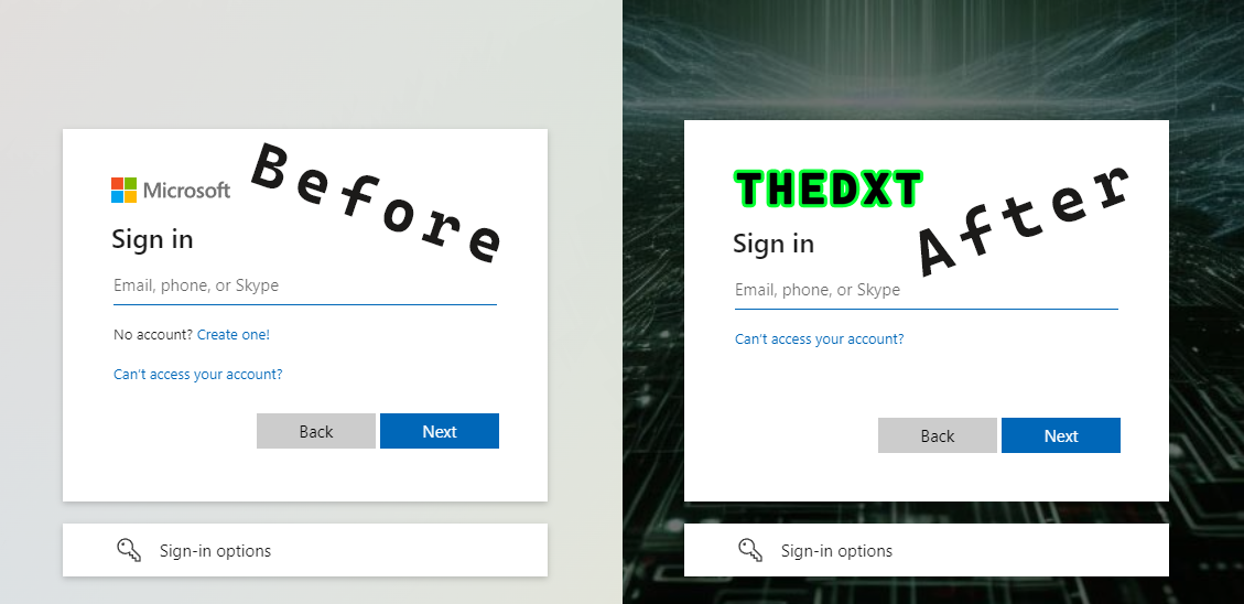
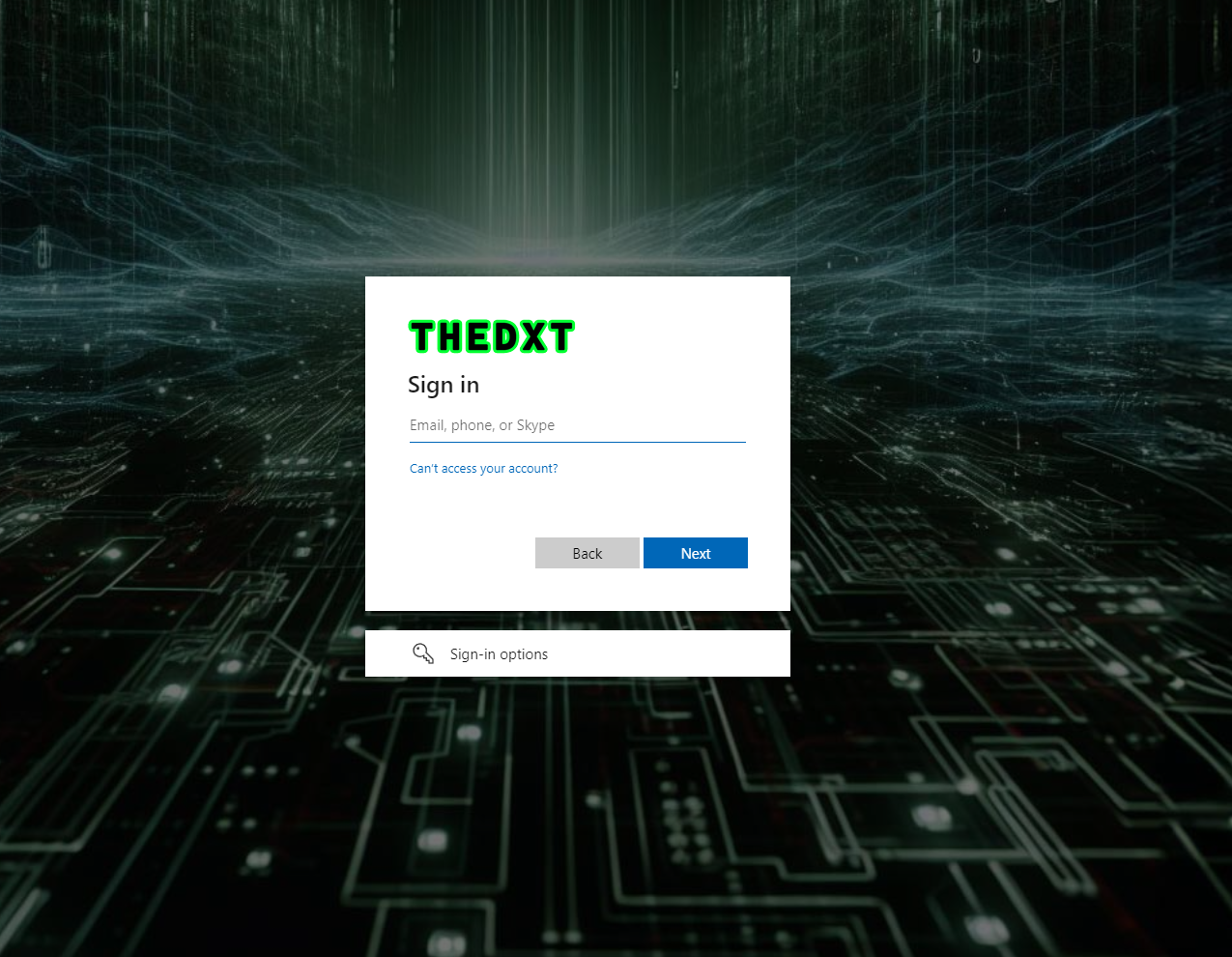
A custom-themed Microsoft 365 sign-in page can augment the user experience by making it easier to tell if it is a phishing sign-in page, as it will help users recognize whether the login page is legitimate or not. It also adds a nice custom tweak to your Microsoft 365 tenant.
In this post, I will show you step-by-step how to customize your Microsoft 365 sign-in page.
The Process
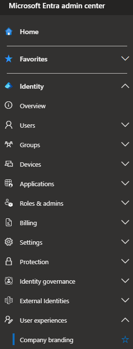
- Log in to the Microsoft Entra admin center
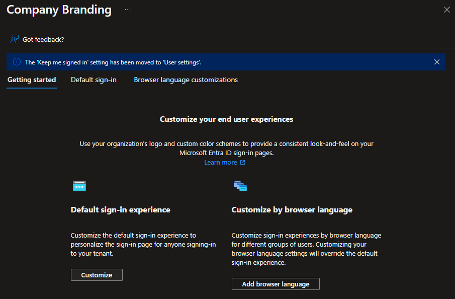
- Click on User Experiences > Company branding
- Under Default sign-in experience, click on Customize
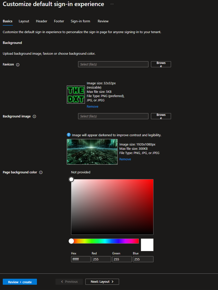
- Upload a Favicon that is 32 x 32 pixels and less than 5 KB in size.
- Upload a Background image that is 1920 x 1080 pixels and less than 300 KB in size.
The background image will be darkened by a black overlay with an opacity of 0.5.
- Click Next: Layout
- Change the Layout as needed.
I like leaving it on the default settings and selecting the option to hide the footer.
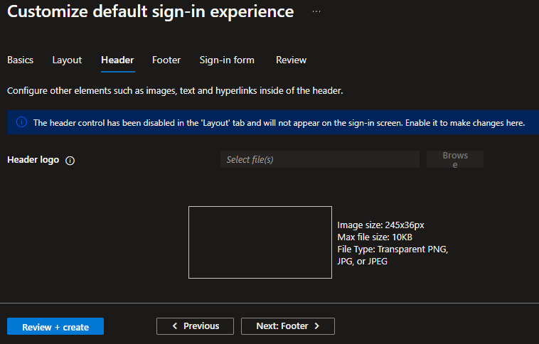
- Click Next: Header
If you have selected the default option of hide the header, you can’t make any changes.
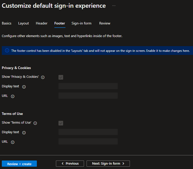
- Click Next: Footer
If you have selected the option to hide the footer, you can’t make any changes.
- Click Next: Sign-in form
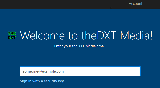
- Upload your Banner logo that is 245 x 36 pixels and less than 50 KB in size.
The banner logo is where the Microsoft logo is normally on the sign-in page.
- Upload your Square logo that is 240 x 240 pixels and less than 50 KB in size for the light theme.
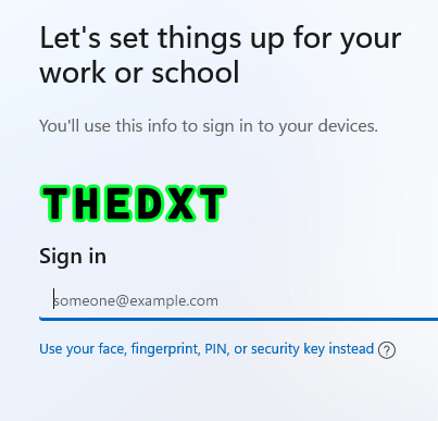
The square logo doesn’t come up often. One of the places I’ve seen it is on the Windows Autopilot screen for Windows 10.
On Windows 11, it displays the Banner logo.
If your logo doesn’t look good on dark themes, you can upload an alternate square logo to be used on dark themes.
- You can set a username hint. However, Microsoft recommends against this.
- You can turn off the self-service password link if needed. I’ve opted to leave it as the default.
- Click Next: Review
- Review the settings. If everything looks good, click on Create.
It will take a bit for your new Login page to be active.
You can see what your login page screen looks like by replacing thedomain.com with your domain in the following URL https://myapps.microsoft.com/?whr=thedomain.com
It is common in some places for your branded sign-in page to only show up after the user enters their email address.
That’s all it takes to make a unique login screen for your Microsoft 365 tenant.
To read more about adding company branding to your Microsoft 365 login screen. Here is the Microsoft documentation about it.
